Knock knock who’s there? We are back with our 4th lesson which is Learn Colours Through Art and today’s theme is Colour Web! An element of art made up of three properties: hue, value, and intensity.
Here’s a quick recap of hue, value and intensity.
Hue is simply the name of a colour, like red, blue or green, name it all. But did you know each hue has so many variations? Blue alone can be sky blue, ocean blue, royal blue or deep navy, and each one feels a little different.
Value is about how light or dark a colour is. When you add white, it becomes lighter while when you add black, it becomes darker, which helps create depth and contrast in artwork.
Intensity is how bright or soft a colour looks; high intensity colours feel bold and powerful, while low intensity colours feel calm, gentle and sometimes even dreamy.
Now, before we begin, dear parents, let’s take a moment to reflect together: what is your child’s favourite colour and what might be the reason behind their choice? Have you noticed how they react when they see that colour in their daily life? Colours are not just visual elements. They also may carry emotion, mood and meaning. This often reflect how children see and understand the world around them.
In today’s art lesson, we will use this connection as a starting point. By exploring hue, value and intensity, children will learn how their favourite colours can be changed, mixed and expressed in different ways through art. This helps them not only understand colour theory, but also express their feelings and imagination more freely on paper.
Let’s explore the world of colours together and see how art brings them to life in the most meaningful and creative way
LEARNING OUTCOMES:
By the end of the lesson, we will:
Apply different colours and observe how they interact with one another.
Develop creativity through experimentation with colour combinations.
Practice colour mixing to understand how new colours are formed.
Appreciate how colours can influence and change the mood of an artwork.
MATERIALS NEEDED:
Poster Colours, Sponges, Threads, Canvas
Safety Tip: Make sure to use non-toxic and child-safe poster colours for safety. Wear protective clothing, such as an apron or old clothes, to prevent stains.

STEP 1
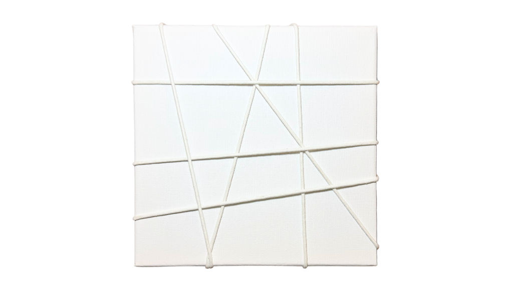
Wrap the thread randomly across the canvas, creating different lines, patterns and spaces to form an interesting base for your artwork.
STEP 2
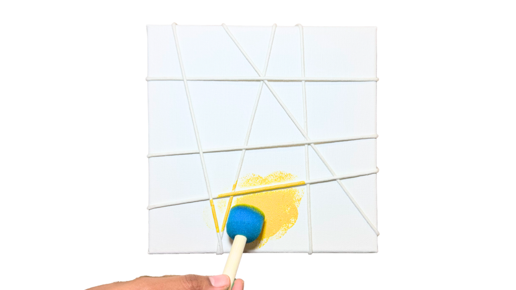
Dab or brush acrylic paint over the canvas, allowing the colours to spread across the threads and surface to create unique patterns and textures.
STEP 3
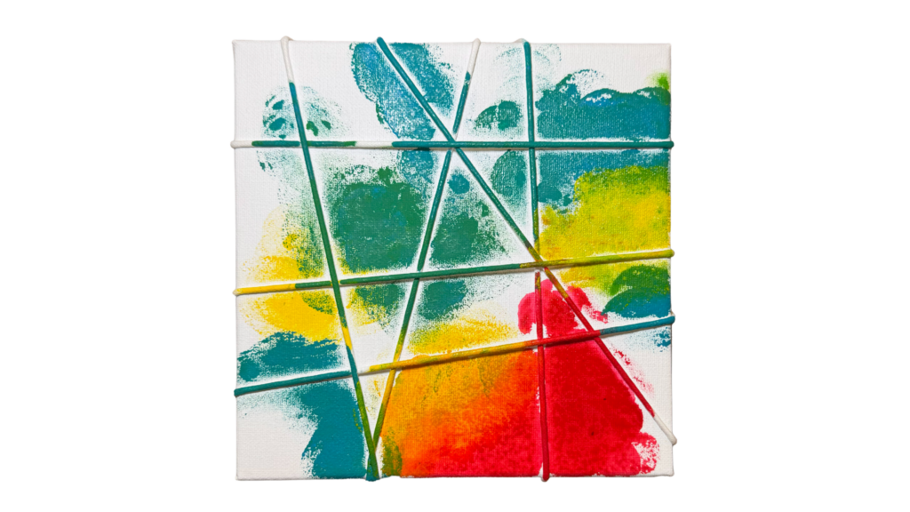
Fill up the canvas with more colours to make the artwork brighter, more vibrant and visually interesting.
STEP 4
Let the canvas dry completely before carefully removing the threads to reveal the unique patterns underneath.
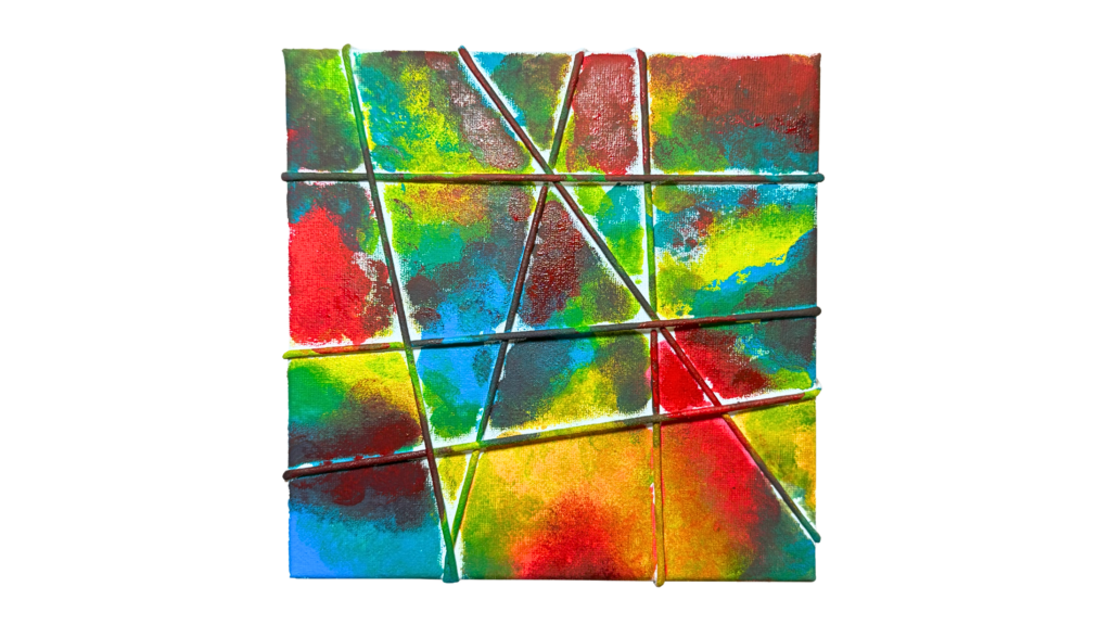
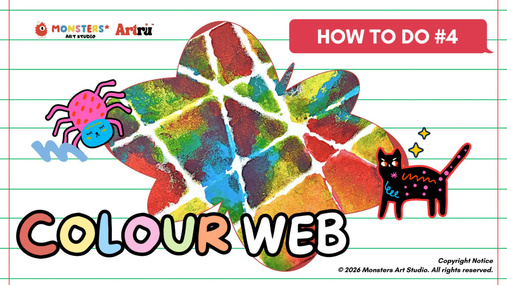
TA-DA! 🌈 YOUR WEB ART IS READY!! 
Voila!! 🎨 It looks just like a colourful spider web, right?
Try experimenting with different colour tones with your children to create different moods and effects. Every colour combination can make your “web” look completely unique and full of personality 😍
Here’s some references to guide you:
Use different palettes like pastel, earth tones, ocean blues or bright neon colours to inspire your child’s creativity and explore new combinations.
Let’s see your creativity shine! ✨ Share your finished web artwork and inspire others with your colourful ideas.